You are not logged in.
- Topics: Active | Unanswered | Last 2 weeks
Pages: 1
#1 2010-05-05 19:29
- narayan
- Senior Member
- Registered: 2009-02-08
- Posts: 470
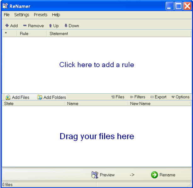
Streamlined GUI (top-to-bottom processing)
See the quick guide: http://www.den4b.com/wiki/ReNamer:Quick_guide
The ReNamer tasks (add rules, add files/folder, and preview) are scattered across the GUI.
For example, task-1 is split into 1a, 1b, and 1c. These controls are located at the top, middle and bottom of the GUI.
It means the user has to go across the ReNamer GUI to accomplish any single task.
(Of course, some of these are optional tasks, but still the point is that these controls are not grouped logically.)
A little re-arrangement can make the GUI extremely streamlined, as shown below.
(The icons need to be resized so that the main function of each area is emphasized properly.)
Last edited by narayan (2010-05-07 00:23)
Offline
#2 2010-06-03 15:05
- den4b
- Administrator

- From: den4b.com
- Registered: 2006-04-06
- Posts: 3,379
Re: Streamlined GUI (top-to-bottom processing)
"Streamlined GUI" sounds great as a concept, but the the proposed layout does not appeal to me at all. This new layout looks wrong to me. ![]()
I will always expect the main functions, such as Preview and Rename, to be at the top.
Offline
Pages: 1